House of Commonground
Branding for House of Commonground, helping companies embed social sustainability and collaboration into their culture.
House of Commonground supports companies in implementing socially sustainable measures and helps anchor these firmly in their everyday operations. By closely collaborating with employees and leadership teams, they develop forward-thinking, responsible, and competitive solutions. Exciting.
“House of Commonground” represents a place for connection and collaboration. For us, it was clear: we wanted to place these values at the center and make them visible and tangible on every level. The goal was to create a visual system that evokes a strong sense of belonging through its light, lifestyle-inspired aesthetic.


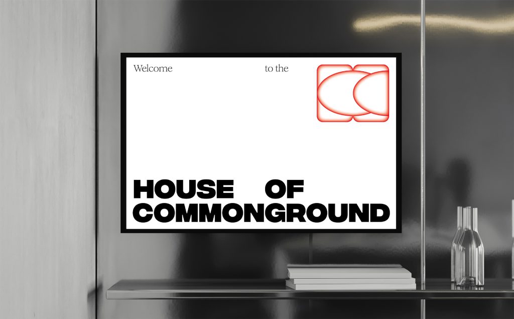
At the heart of the concept lies a striking wordmark, which serves as the foundation and conveys presence and reliability through its bold typography. The individual service areas – Community, Colab, Consulting, and Collective on Commonground – build upon this foundation both verbally and visually. Complementing the wordmark is a logo in the form of an abstract monogram (“HOC”) with a seal-like design, evoking the sense of a club and symbolizing community.
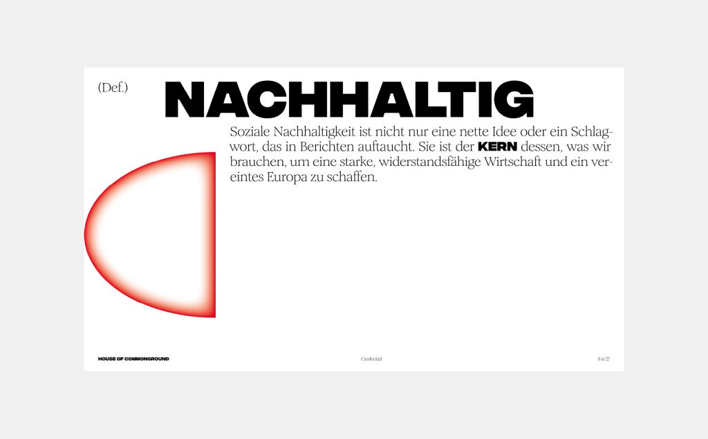
The visual concept thrives on contrasts. A robust sans-serif font interacts with delicate serif typefaces, while generous white spaces, combined with typography and design elements, create a harmonious structure. The color palette is dominated by a vibrant red, complemented by shades of blue and yellow. Blue represents the service areas, while yellow symbolizes social themes. These colors also feature prominently in the calm and distinctive imagery, enhancing the brand’s recognizability.